World Headquarters

Our corporate symbol over the years
The Yazaki Group’s corporate symbol
What is the story behind the “arrow mark,” and what ideals does it represent?
HOME Our corporate symbol over the years
A crimson arrow headed to the future
Let’s take a look at the Yazaki Group’s corporate symbol over the years, and examine the ideals it embodies.

Corporate symbol
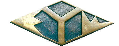
The arrow mark over the years
A crimson arrowhead driving straight into the future. Yazaki’s arrow mark adorns Yazaki Group factories and offices in Japan and throughout the world, and is familiar to people in regional communities as a logo representing “the local company.” It also appears on various Yazaki products as a mark of quality, and serves as a symbol of dependability for consumers.
The emblem was born in May of 1953, when it received public approval from the Patent Agency. The company began studying a new emblem two years earlier, when it celebrated its tenth anniversary. The aim was to create an image that was innovative and fresh. Until then, the emblem had been a diamond shape enclosing a “Y” for “Yazaki” in the center, with an “E” for “electronics” on the left side, and a “W” for “wire” on the right side, thus forming the initials of Yazaki Electric Wire, the English translation of Yazaki Densen.
The person who came up with the new design was Sadami Yazaki, the company’s founder. “The shape of the ‘E’ on the left side of the old emblem looks like the ‘矢’ (pronounced “ya” and meaning “arrow”) of 矢崎 (Yazaki),” he said. “Let’s go with that! "According to a legend associated with Mori Motonari, a great commander during Japan’s Warring States period, three arrows tied together will not break and thus demonstrate the importance of unity. The new emblem’s production proceeded without the help of a single outside design expert. Instead, it was refined by bringing together ideas solely from Yazaki employees, particularly those at the department manager level. The project gained further momentum as ideas generally solicited from around the company were also referenced. The end result is today’s arrow mark.
Over the years it has been said…
- 1.
- The crimson color represents passion and unity.
- 2.
- The upper horizontal line represents universal brotherhood; in other words, it expresses clear and simple human relationships free of academic cliques or factions.
- 3.
- The slanting line at the bottom represents the desire to always reach upward to achieve goals in a manner that is both appropriate and realistic.
- 4.
- The three protrusions on the right express the unity of Yazaki’s three existing main factories (Tokyo, Shimada and Washizu) when the emblem was first designed in 1951.
The box above presents the design concept at that time. Evoking the image of a crimson arrow flying on a path toward the future, the emblem gives a sense of dynamic strength. Even today, a half-century after its creation, the enthusiasm and passion that Yazaki people poured into it come through loud and clear.
(Reprinted from the Yazaki Group’s 50th Anniversary History)
The corporate symbol over the years